
Most route inefficiencies do not appear overnight. They creep in gradually until nobody questions them anymore. A collection runs a bit long, an extra journey gets factored in, and before long, a return visit that could have been avoided is just another thing on the schedule. It becomes the way things work without anyone sitting down and deciding that it should.
In waste and logistics businesses, routes sit at the centre of everything. When they work well, the day runs to plan, costs stay predictable, and service feels consistent. When they do not, inefficiencies settle in without much fuss, and what starts as a small gap between the plan and reality has a way of quietly becoming higher costs and days that are harder to get through than they should be.
When small gaps become a real cost
Route plans are built on the best information available at the time, but operations move on, and what worked well six months ago may no longer reflect what is actually happening on the ground. Without a clear view of how things are running, that kind of drift is difficult to spot while it is happening, and by the time it shows up in the numbers, it has usually already done some damage.
Extra mileage creeps in, collections take longer, and fuel usage climbs without any obvious single cause. Service gets patchier, not because the team is doing anything wrong, but because the operation has moved on while the reporting has not. It does not announce itself as a problem; it just starts to feel like the days are harder than they used to be.
The assumption at that point is usually that a better optimisation tool is the answer, but in most cases, the real issue is more straightforward. It is not that the routes cannot be improved; it is that they are difficult to see clearly, and once teams have a proper view of what is happening across routes, collections, and vehicle performance, the right adjustments tend to become fairly obvious.
Research into data-driven waste collection backs this up. Real-world case studies have shown that better visibility of route performance leads to meaningful reductions in collection frequency, trip distance, and fuel usage, with one study finding around a 15% reduction in collections and a 25% reduction in trip distance. Those gains came not from more complex algorithms but from giving people a clearer picture of what was actually going on.
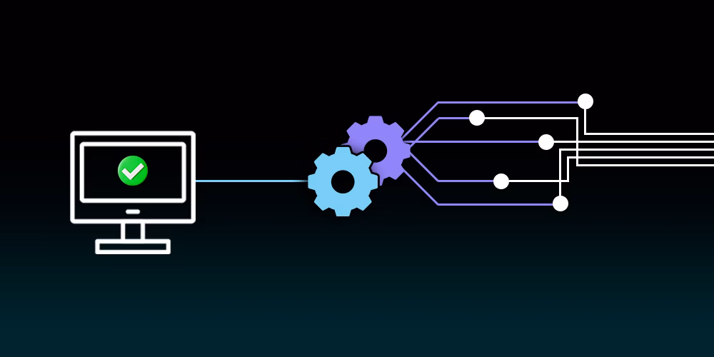
When the picture comes together
In most organisations, route data, fuel records, and service history all sit in different places, and while each one tells part of the story, the overall picture is hard to read. Reporting ends up being reactive, and by the time something stands out in the numbers, it has usually already had an impact on cost or service.
When that information comes together in one place, things tend to click. Patterns become easier to spot, shifts in performance get picked up earlier, and most of the improvements that follow come not from one significant change but from smaller corrections made consistently, a route tidied up here, a decision made with the full picture rather than part of it.
If route performance has started to feel harder to get a handle on than it should, we would be glad to talk through what that could look like in practice.